Goizueta workshops help improve business skills

If you are a Tableau expert, who cranks out beautiful, useful data visualizations on a regular basis, this article is likely not for you. If, however, you have heard of Tableau, maybe you understand the power of distilling big datasets into digestible visualizations but you haven’t yet downloaded it for free to play with it, keep reading. Tableau is data visualization software — it’s designed to take an organized data source as an input and help you create visualizations based on that data. Though I’ve only yet used data originating from Microsoft Excel, which is a great place to get started, Tableau can also connect to all manner of databases, including Oracle, SAP, SQL and more.
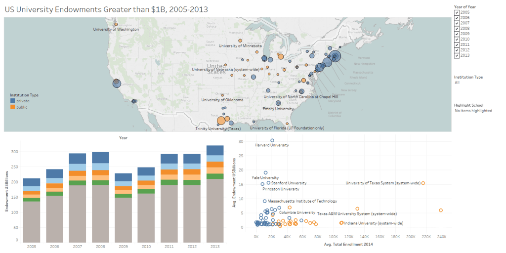
On a Wednesday night after work, I walked into the “Intro to Tableau” workshop at Goizueta, led by Megan Slemons, not knowing a thing about the software other than I had heard it was cool, useful and in demand. I wanted to know more. During the one-hour workshop before actual classes started that evening, our small group used sample data on U.S. universities and their endowments to create multiple worksheets with charts visualizing key indicators within the data. The final output was an interactive dashboard showing three of these charts that made the data very easy for a user to digest.
![]() A week later at work, while writing a report on my recent visit to one of my airline customers, I found a perfect excuse to put that knowledge to good use. One key section of my regular customer reports is titled “Fleet Updates.” This section is an opportunity to inform the rest of my company about the status of and changes to a particular airline customer’s fleet. Typically, I just write some words here, a few paragraphs on additions, retirements and new airplane orders. With a download of my customer’s most recent fleet data from FlightGlobal’s fleet analyzer in hand, I thought I could do better — with Tableau. With an hour’s worth of work I was able to create an interesting dashboard showing, at a glance, the breakdown of FedEx’s air fleet by aircraft type, manufacturer and engine type (key items of interest to my leadership) as well as the distribution of aircraft age within that fleet. Historically I have reported average fleet age-by-type, however, the data visualization I created provides a more intuitive and more complete representation of the age data.
A week later at work, while writing a report on my recent visit to one of my airline customers, I found a perfect excuse to put that knowledge to good use. One key section of my regular customer reports is titled “Fleet Updates.” This section is an opportunity to inform the rest of my company about the status of and changes to a particular airline customer’s fleet. Typically, I just write some words here, a few paragraphs on additions, retirements and new airplane orders. With a download of my customer’s most recent fleet data from FlightGlobal’s fleet analyzer in hand, I thought I could do better — with Tableau. With an hour’s worth of work I was able to create an interesting dashboard showing, at a glance, the breakdown of FedEx’s air fleet by aircraft type, manufacturer and engine type (key items of interest to my leadership) as well as the distribution of aircraft age within that fleet. Historically I have reported average fleet age-by-type, however, the data visualization I created provides a more intuitive and more complete representation of the age data.
If you are interested in learning to use Tableau go to www.tableau.com and download a copy of Tableau public. It’s free for anyone to use. Goizueta students can also download and use the full version of Tableau under an academic license free of charge. Tableau’s own website along with YouTube both have a number of resources for beginners just getting started. If you want some inspiration, check out Tableau’s Viz-of-the-day. https://public.tableau.com/en-us/s/gallery
